MR. NOODLES REDESIGN
An Instant Classic,
Reinvented for Shelf Star Fame
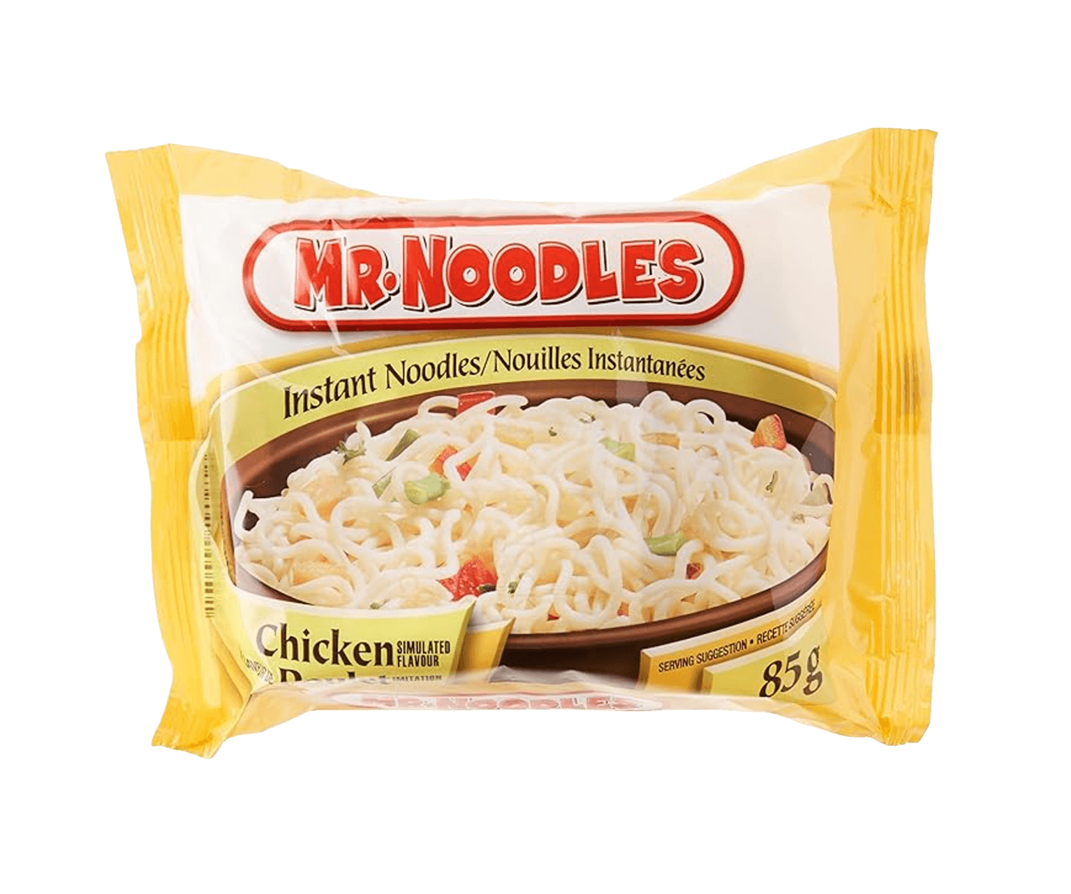
The Mr. Noodles brand of instant noodles is a classic, dating back to the 1970s. These instant noodles are offered in a variety of flavours and are sold in packages the same size as traditional ramen portions. Mr. Noodles Instant Noodles are known by customers as delicious, budget-friendly, and distinctly un-nutritious—the perfect food for the average college student and convenience-focused shopper.
The ask for this project was to redesign the existing Mr. Noodles Instant Noodles packaging with sustainability in mind. The packaging needed an upgrade that would move away from wasteful plastic and feel fresh and impressionable, catching customers’ eyes as they stroll through the monotony of instant noodle products lining the shelves.
THE PROCESS
The redesign process started with research into the product and customer base. Research uncovered the key selling points of the noodles: its affordability, convenience, and versatility. Mr. Noodles Instant Noodles can be prepared in minutes, using a microwave or over the stovetop, and the product’s low price point makes it a budget-friendly meal option. Furthermore, Mr. Noodles Instant Noodles offers considerable versatility—it can be consumed as a meal or as a snack, with side dishes or without, as a broth or a stir-fry.
While focusing on these key selling points and the feelings associated with the prep and consumption of the noodles themselves, I began sketching and generating ideas for the design. I created mock-ups and engaged in an iterative process that involved incorporating feedback from peers and professors.
THE SOLUTION
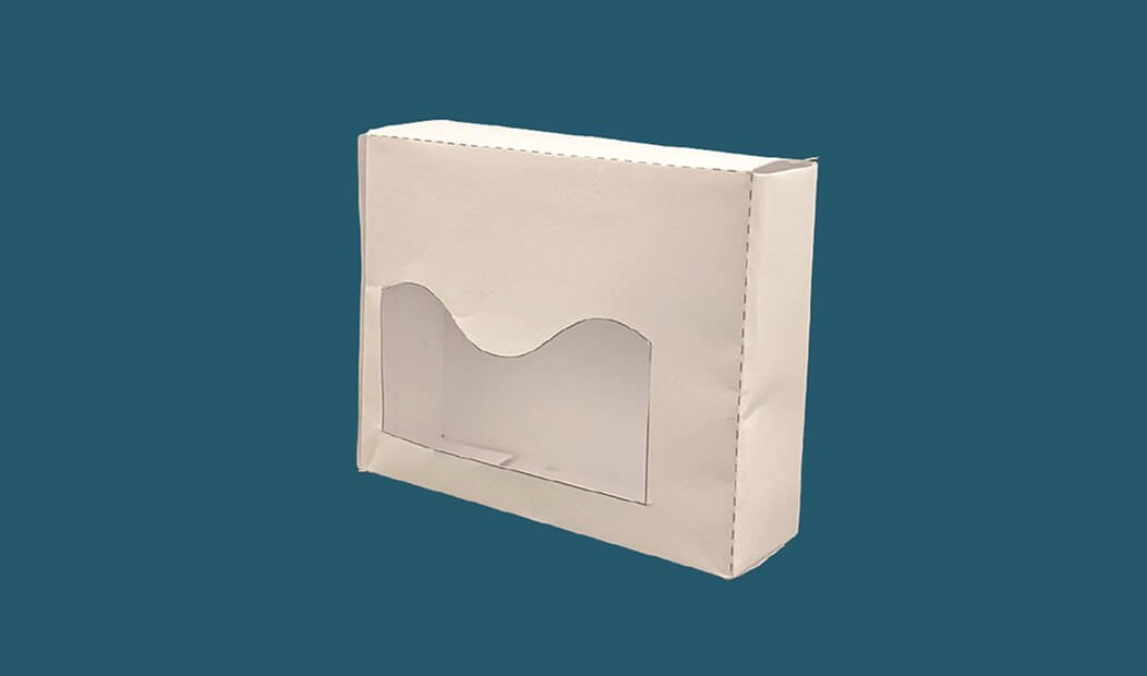
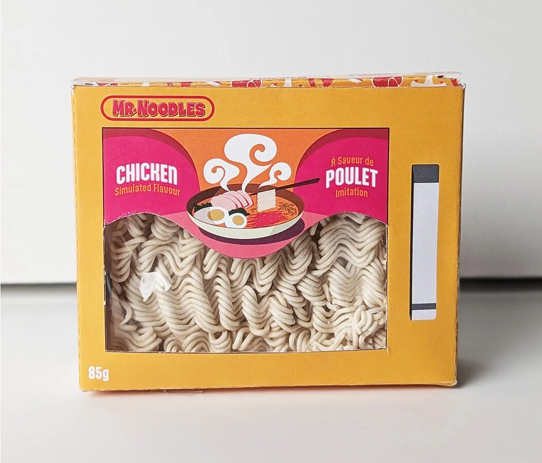
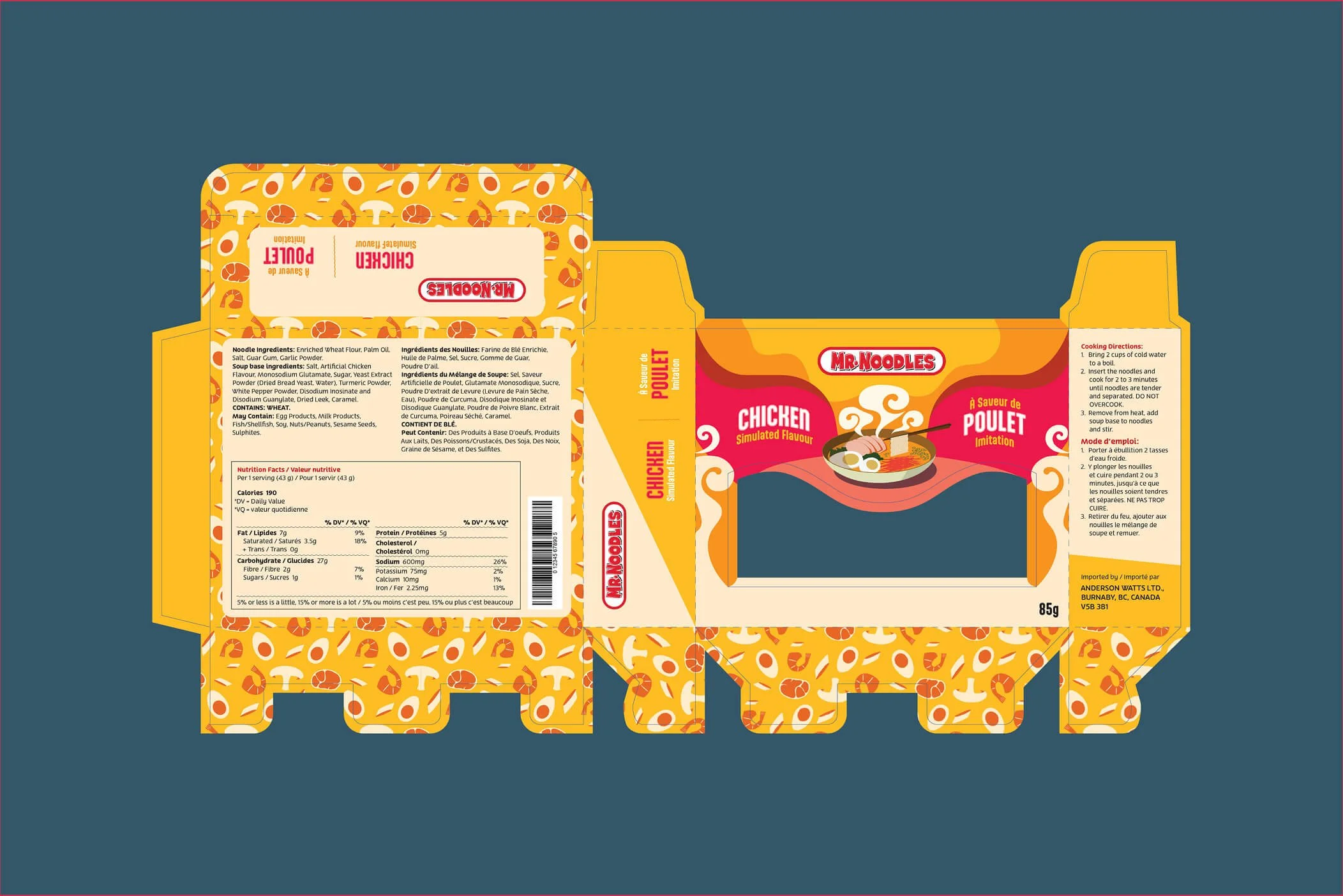
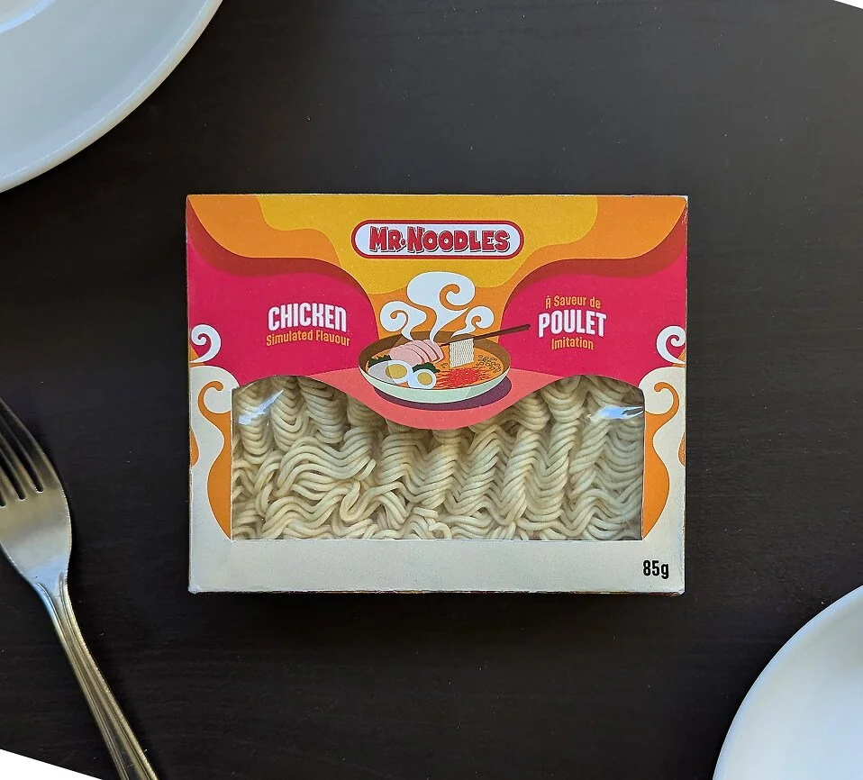
The final solution is a sustainable packaging design with a custom die-cut window and fun and playful illustrations. The packaging is environmentally conscious, using a paper-based solution with a plant-based coating, and is a refreshing break from your average instant noodle packaging.
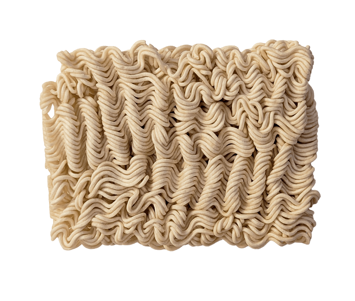
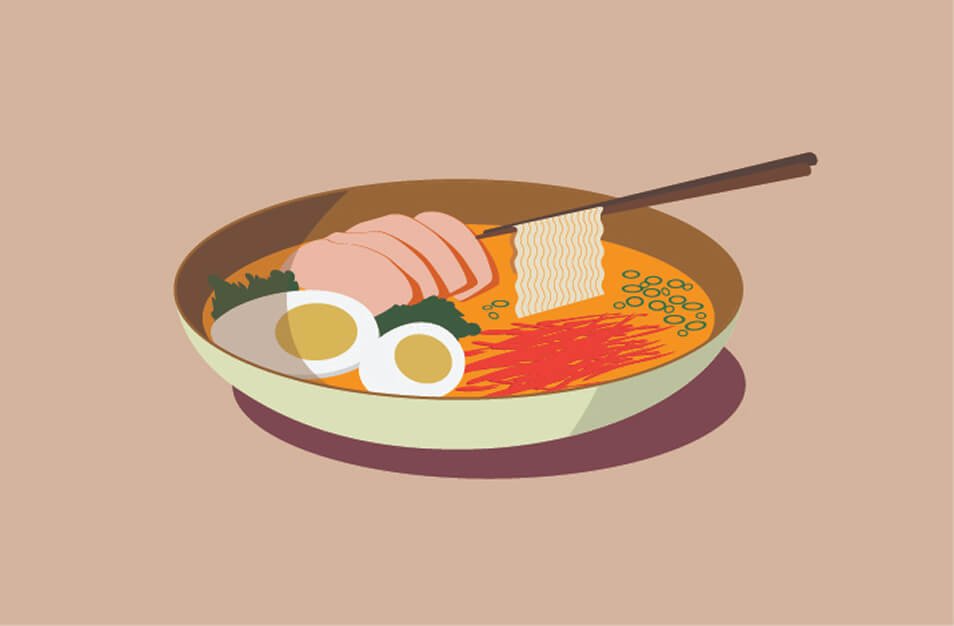
The final design introduces a custom die-line with a transparent window that emphasizes the noodles’ wavy form and allows customers to see the product and verify the quality for themselves, without having to rely solely on a product picture or description to come to a purchasing decision. The window acts as a framing device for the noodle bowl illustration, the focal point of the front-page packaging. The wave element of the window is repeated across the rest of the design to create cohesion and consistency.
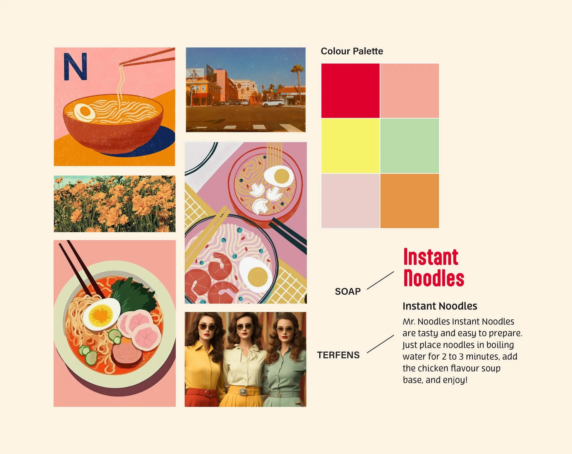
The design references the warmth of freshly cooked noodles, nostalgic and cultural aspects, and textural elements of the noodles themselves. A strong, bright colour palette is introduced, along with a playful illustrated pattern. The design radiates warmth, energy, and a soothing tempo—the perfect vibe for an audience of post-secondary students and young adults looking for a homey and convenient meal or snack.


